
Jupyter 常见可视化框架的选择_光环大数据培训
8页
1、 光环大数据光环大数据-大数据培训大数据培训 sns.set(color_codes=True)iris = sns.load_dataset(“iris“)species = iris.pop(“species“)g = sns.clustermap(iris)光环大数据光环大数据-大数据培训大数据培训&人工智能培训人工智能培训http:/ 光环大数据光环大数据 http:/plotlyplotly 是跨平台 JavaScript 交互式绘图包,由于开发者的核心是javascript,所以整个语法类似于写 json 配置,语法特质也介于陈述式和命令式之间,无服务版本是免费的。有点是学习成本不高,可以很快将语句移植到 javascript 版本;缺点是语言相对繁琐。#plotly 示例 import plotly.plotly as pyimport plotly.graph_objs as go # Add datamonth = January, February, March, April, May, June, July, August, September, October,
2、 November, Decemberhigh_2000 = 32.5, 37.6, 49.9, 53.0, 69.1, 75.4, 76.5, 76.6, 70.7, 60.6, 45.1, 29.3low_2000 = 13.8, 22.3, 32.5, 37.2, 49.9, 56.1, 57.7, 58.3, 51.2, 42.8, 31.6, 15.9high_2007 = 36.5, 26.6, 43.6, 52.3, 71.5, 81.4, 80.5, 82.2, 76.0, 67.3, 46.1, 35.0low_2007 = 23.6, 14.0, 27.0, 36.8, 47.6, 57.7, 58.9, 61.2, 53.3, 48.5, 31.0, 23.6high_2014 = 28.8, 28.5, 37.0, 56.8, 69.7, 79.7, 78.5, 77.8, 74.1, 62.6, 45.3, 39.9low_2014 = 12.7, 14.3, 18.6, 35.5, 49.9, 58.0, 60.0, 58.6, 51.7, 45.2, 32
3、.2, 29.1 # Create and style tracestrace0 = go.Scatter( x = month, y = high_2014, name = High 2014, line = dict( color = (rgb(205, 12, 24), width = 4)trace1 = go.Scatter( x = month, y = low_2014, name = Low 2014, line = dict( color = (rgb(22, 96, 167), width = 4,)trace2 = go.Scatter( x = month, y = high_2007, name = High 2007, line = dict( color = (rgb(205, 12, 24), width = 4, dash = dash) # dash options include dash, dot, and dashdot)trace3 = go.Scatter( x = month, y = low_2007, name = Low 2007,
4、 line = dict( color = (rgb(22, 96, 167), width = 4, dash = dash)trace4 = go.Scatter( x = month, y = high_2000, name = High 2000, line = dict( color = (rgb(205, 12, 24), 光环大数据光环大数据-大数据培训大数据培训&人工智能培训人工智能培训http:/ 光环大数据光环大数据 http:/width = 4, dash = dot)trace5 = go.Scatter( x = month, y = low_2000, name = Low 2000, line = dict( color = (rgb(22, 96, 167), width = 4, dash = dot)data = trace0, trace1, trace2, trace3, trace4, trace5 # Edit the layoutlayout = dict(title = Average High and Low Temperatures
《Jupyter 常见可视化框架的选择_光环大数据培训》由会员gua****an分享,可在线阅读,更多相关《Jupyter 常见可视化框架的选择_光环大数据培训》请在金锄头文库上搜索。
做运营60%靠思维,40%靠经验,你的思维跟得上吗_光环大数据培训

长沙BI大数据培训_BI大数据工程师需要具备哪些高薪技能_光环大数据培训

智慧交通大数据平台搭建过程及应用案例_光环大数据培训
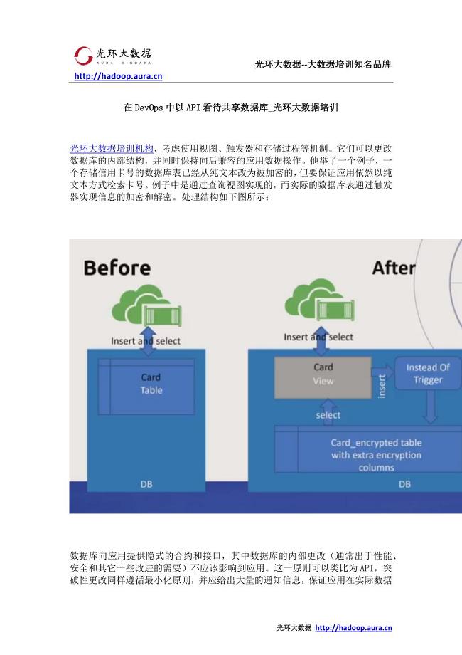
在DevOps中以API看待共享数据库_光环大数据培训

怎样才能成为一个高级Java工程师 —光环java培训机构

这可能是一篇数据化运营的大纲_光环大数据培训
自学大数据能找到工作吗_光环大数据培训

长沙大数据公司有哪些 参加大数据培训有钱途吗_光环大数据培训

中国大数据成熟盈利模型尚未建立_光环大数据培训

针对 MySQL 大规模数据库的性能和伸缩性的优化_光环大数据培训

怎样做数据分析_数据分析方法大全

怎么学习数据分析_数据分析软件汇总

怎样成为数据分析师_光环数据分析师培训

在大数据迅猛发展的今天隐私保护成了难题_光环大数据推出AI智客计划送2000助学金

长沙cpda数据分析培训_cpda考试流程

运营之道,千变万化,存乎一心_光环大数据培训

在Hadoop上运行Docker容器的六大陷阱_光环大数据培训
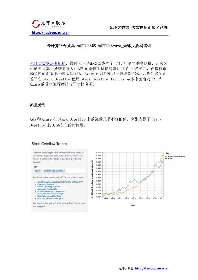
云计算平台点兵 谁在用AWS 谁在用Azure_光环大数据培训

自学java编程语言和参加java培训哪个更有前途—光环java培训机构

最用心的运营数据指标解读_光环大数据培训
 综合实践《巧手剪窗花》教学设计
2022-11-05 10页
康定与《康定情歌》的不解之缘.doc
2023-12-02 7页
(最新整理)店长岗位职责说明书
2023-07-25 5页
2021年幼儿园小班第二学期教学工作计划
2023-02-08 11页
2020年在职级晋升集体谈话会上的讲话
2023-11-21 5页
2020部编版一年级语文上册单元知识点归类汇总
2023-06-01 10页
小学生经典团队游戏和室内游戏
2023-07-27 10页
电频车自动跟随系统.docx
2023-01-04 7页
确山县第四初级中学“礼仪制度传播主流价值”活动报告;
2022-11-03 3页
在新任科级干部任前集体廉政谈话会上的讲话
2024-02-05 4页